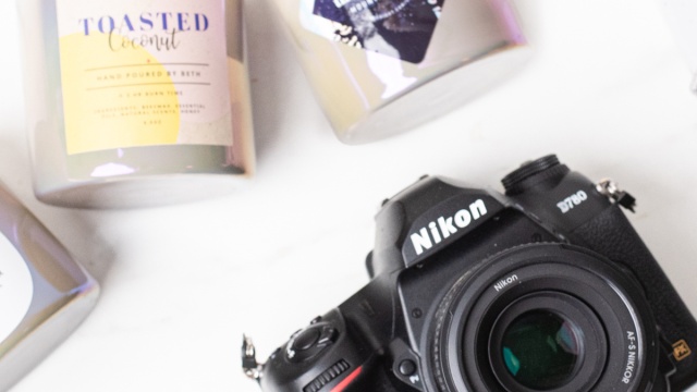
Candle photography challenge: a look at styling and branding We turned to the pros—our in-house photographers—to demonstrate how product styling, branding, and photography can determine the overall vibe of your candles and convey different moods.
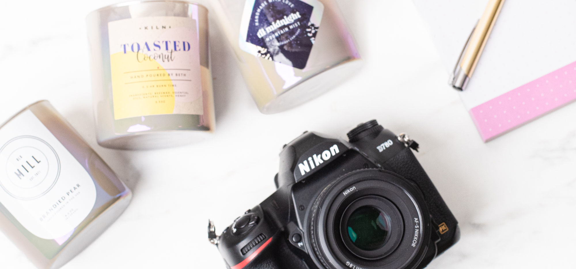
There are so many different types of candle makers, but they share a common thread: they’re creative. They can turn a simple jar into a living art piece that evokes specific emotions, tells a story, or adds an aura of comfort to one’s home. And with that same jar, a different maker can accomplish an entirely different creative feat.
The maker’s wax, fragrance, wicks, and process—what’s inside the container—matters. But the outside of the container is just as important!
The branding challenge: one candle, three ways
We challenged three of our CandleScience photographers—Stanford, Julia, and Kasper—to style and take photos of the same candle.
In order to see how different the end results would be, we made three identical candles in the same container, labeled them with labels from Avery, and gave one to each photographer. They each selected their own lids and staging props from our supply.
The materials and options
Labels have a huge impact on how a finished candle looks. They don’t just share information; they can act as a great first impression, convey a message or mood, and underscore the professionalism of your brand.
A container is a canvas. And while you may use the same canvas as other makers, your final product will showcase your unique perspective and individual branding aesthetic. Then, photography showcases your creative vision through product and lifestyle images.
A neutral canvas: about the candle container
Our Taupe Iridescent Tumbler Jar is the neutral canvas for this branding experiment.
Its base color is about as neutral as you can get, but the shine it gives off reminds us of the crystalline iridescence of mother-of-pearl. The iridescent finish can shift depending on how the photographer uses light, which makes it perfect for this challenge.
The container is also versatile—it works for both high-end and mass-market branding aesthetics. Its straight sides make it easy to apply labels of various shapes, sizes, and materials. Plus, there are so many lid options for this container, allowing for even more customization options!
Tropical luxury: Kasper’s entry
Camera of choice: Canon R5 with a 50mm or 85mm lens
Go-to photography accessory: Aputure light
Favorite CS fragrance: Redwoods and Moss
Tell us about your process: I started by smelling the Toasted Coconut fragrance oil to get some inspiration. I got beachy vibes from it so started going down that route in terms of styling. I was thinking of a beach bar kind of setting and I grabbed some props with that environment in mind.
I set the lighting to reflect that tiki bar-type feel and tried to echo some of the colors that were on the label with the shells. The wood lid helped bring in some warmth that felt right, so that was why I also chose a wood surface to set the candle on. I wanted some depth to try and create some sort of environment around the candle and ended up merging 3 shots together to incorporate more of the plant in the foreground.
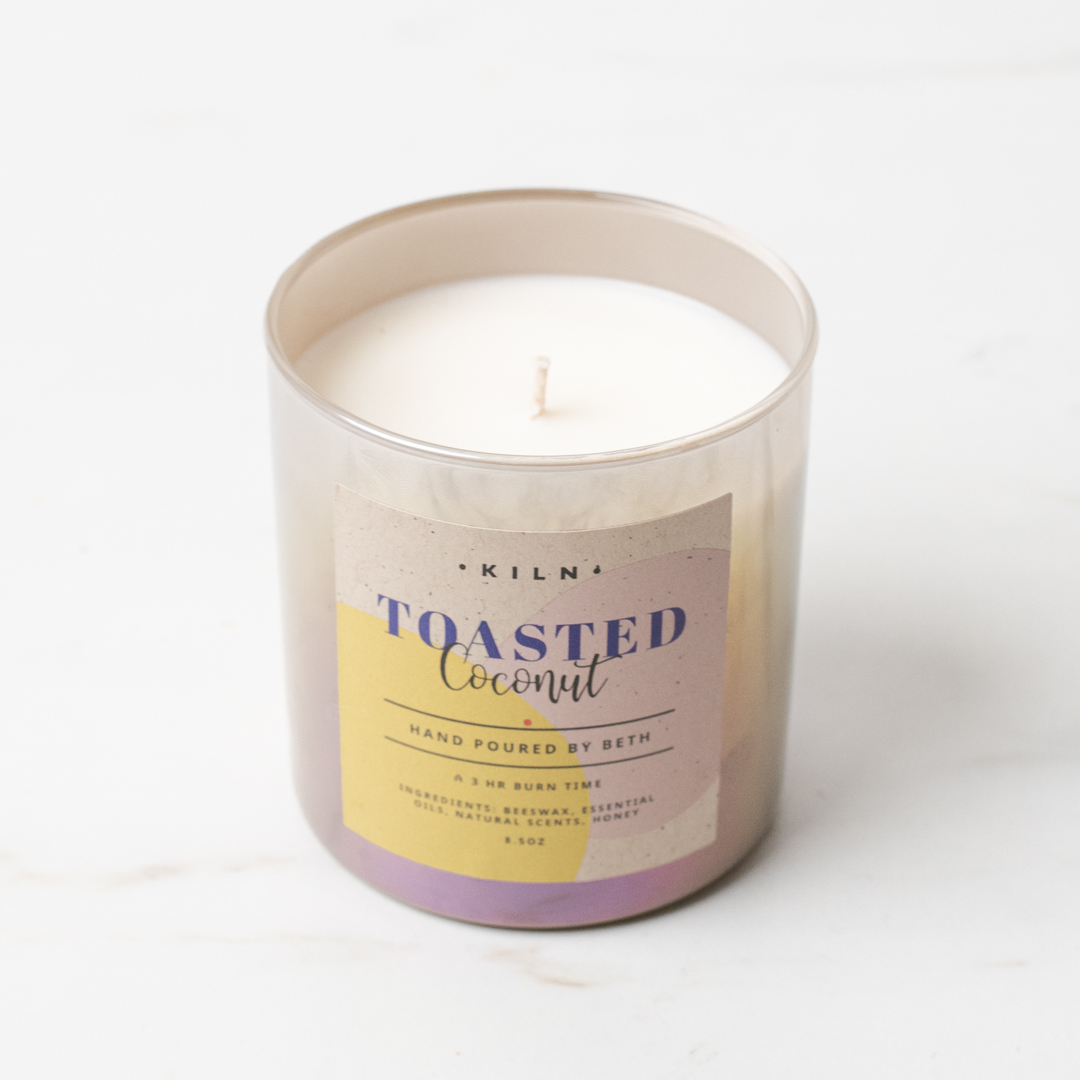
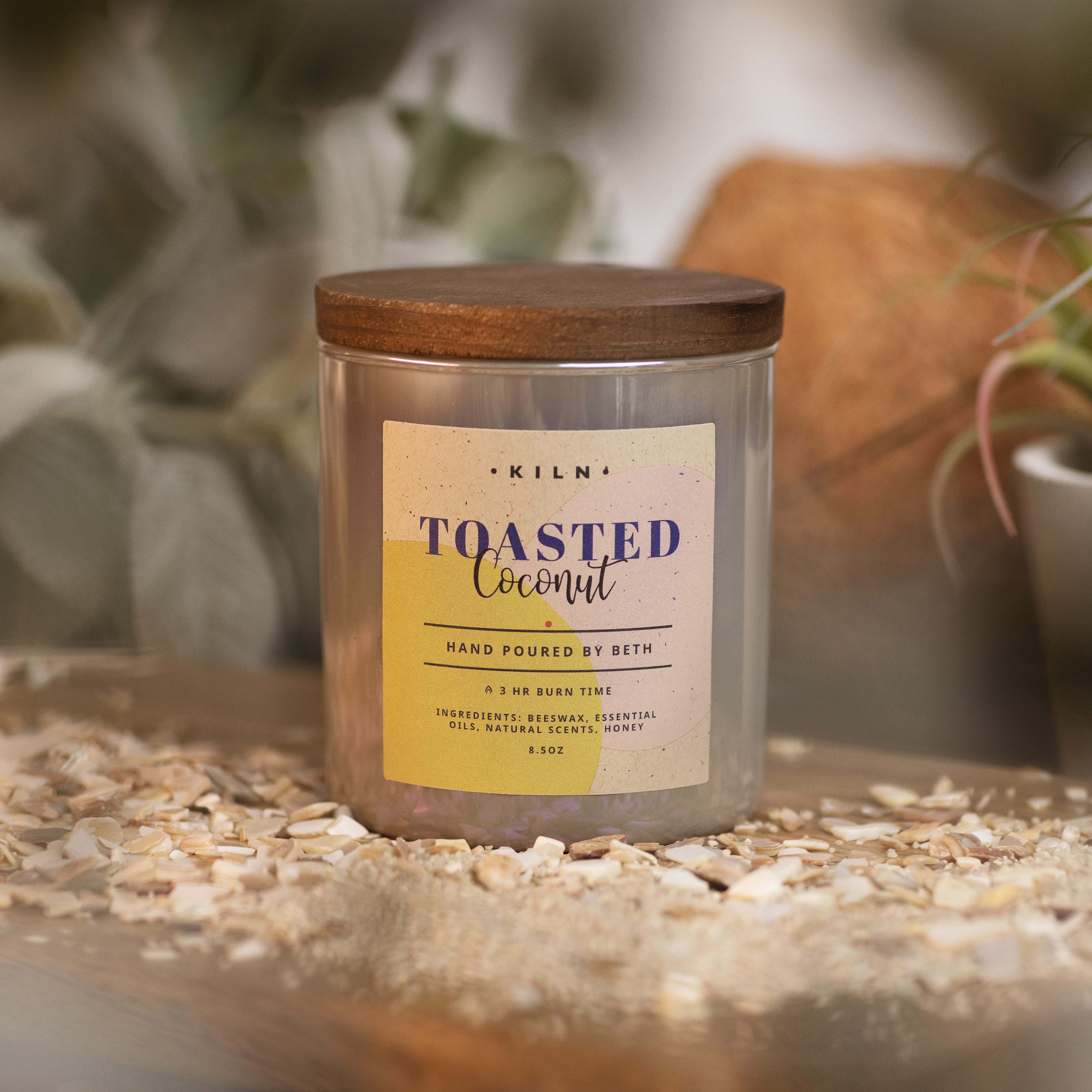
This label is a 2- ½” square printed on Avery WePrint Kraft Paper
Dark and mysterious: Stanford’s entry
Camera of choice: Canon EOS-1V with a 55mm lens
Go-to photography accessory: Battery-powered flash with a remote trigger
Favorite CS fragrance: Orange Creamsicle
Tell us about your process: I started with the candle company name and candle scent Til Midnight’s Mountain Mist. If Til Midnight was my brand, I feel it would be more of a mysterious and dark kind of edgy vibe.
With that kind of mood in mind, I leaned into a chiaroscuro lighting style and decided to introduce some smoky mountain vibes with vapors in the image. The RGB lighting really pulled the image together and solidified the mood.
Note: An Italian term, Chiaroscuro is a high-contrast lighting technique that helps give a three-dimensional quality in photos.
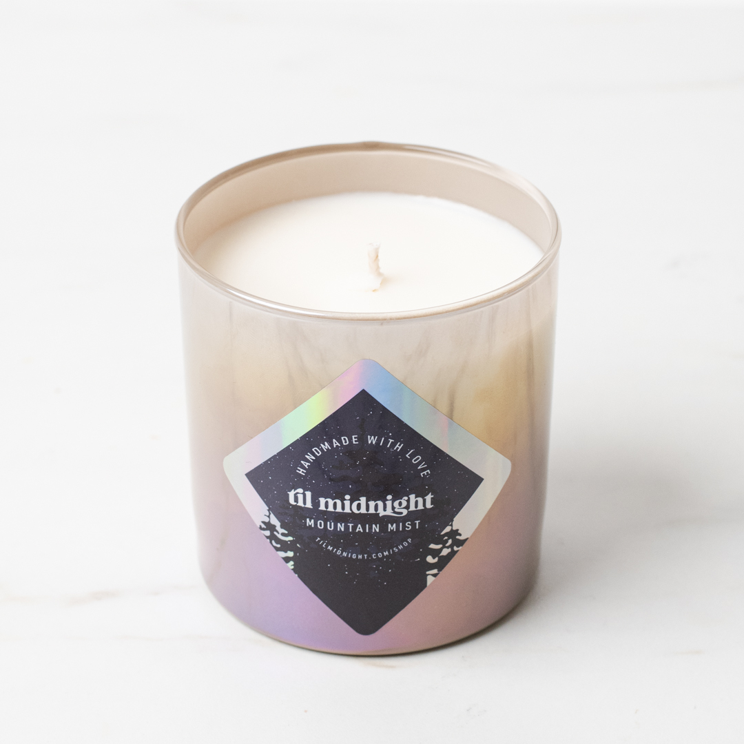
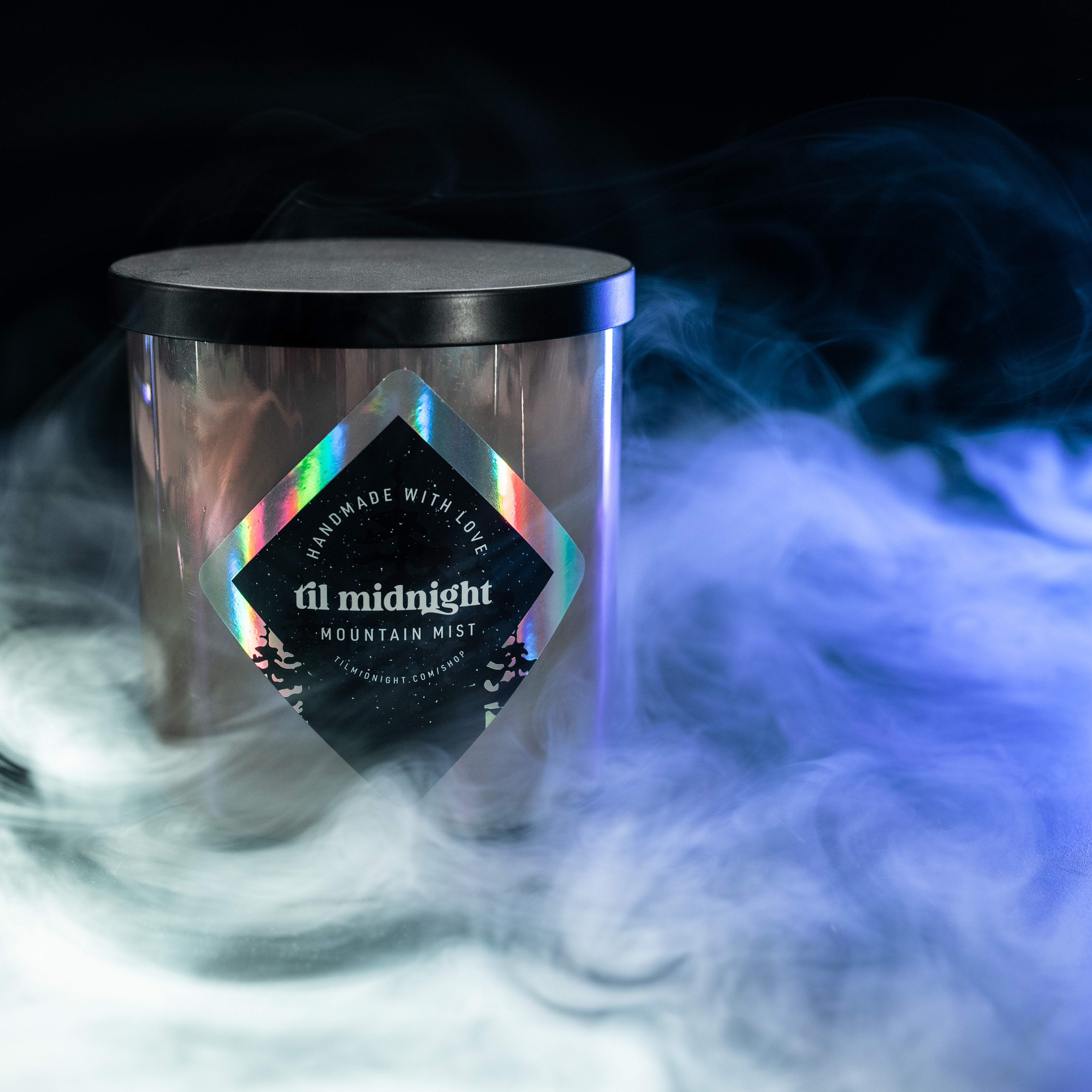
This label is a 2” x 2” square printed on Avery WePrint Rainbow Holographic Film
Upscale simplicity: Julia’s entry
Camera of choice: Canon 5D Mark III with a 50mm lens
Go-to photography accessory: Soft box using continuous light
Favorite CS fragrance: Grapefruit and Mint
Tell us about your process: I started by looking up the fragrance on the label on our website and making note of its individual notes and colors. Since the label was simple but the jar has a few different colors in the shine, I wanted to pull from that to create a fun and eye-catching image.
After collecting and preparing the ingredients—sugar, pear, cardamom, and cinnamon—and choosing a background that would complement the existing colors, I needed to think about composition. I wanted to stay with the simplicity of using the ingredients but keep it fun and unique so I decided to shoot a set of images with an arm holding a different ingredient in each shot while lighting it with a very simple one light setup.
It felt like something was missing so I decided to add a bit more color and chose some pink florals to work with the teal backdrop and the pink shades in the container. I then combined the images using photoshop and tweaked the coloring. Overall I just wanted to have fun and create an image that would not only portray the candle's scent but also the vibes of the container!
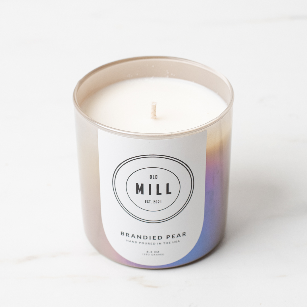
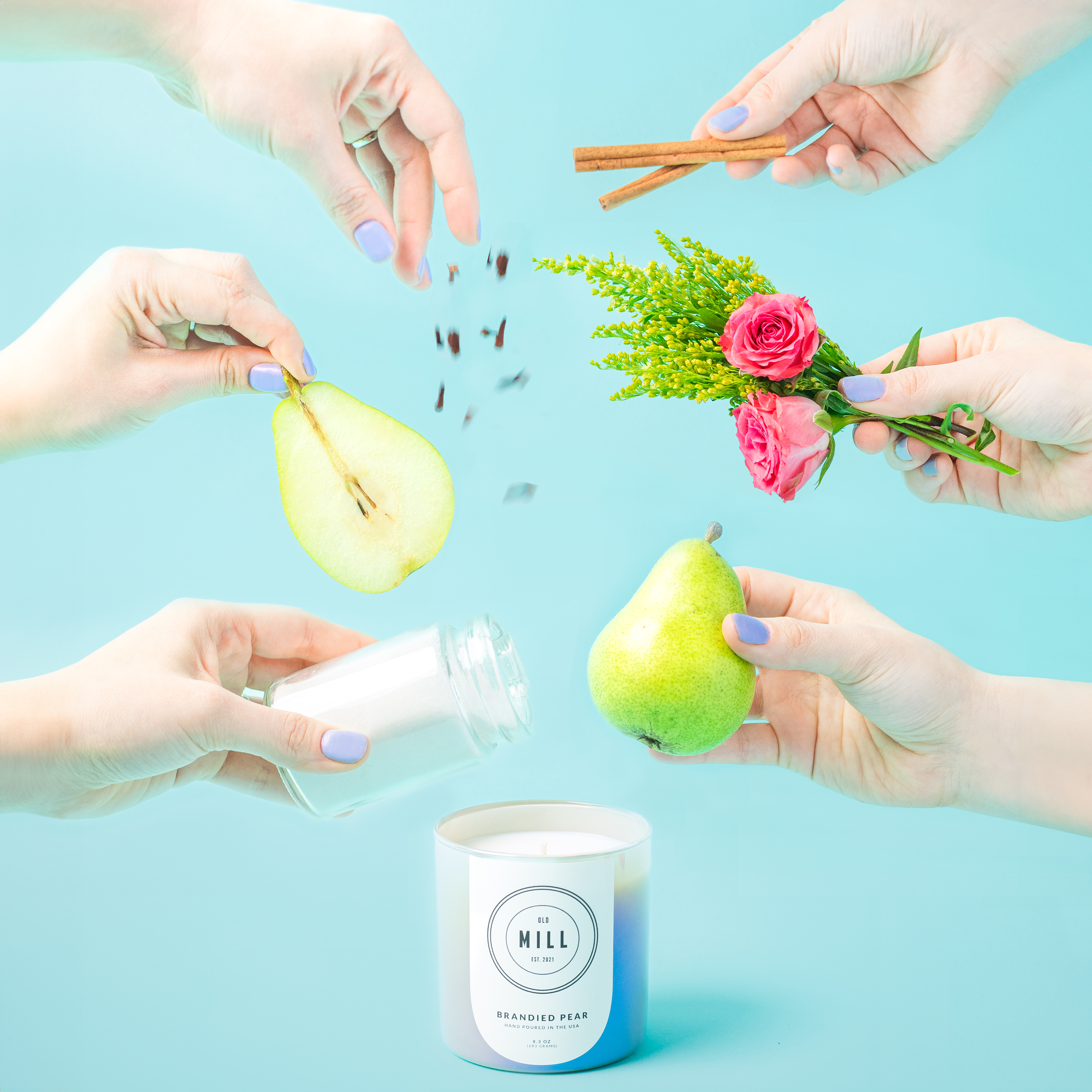
This label is a 3/64” x 2 ¼” arch printed on Avery WePrint Removable White Vinyl Film
Now it's your turn!
Our photographers are so talented! Can you believe how different the same candle looks when styled and photographed by each of them? The Taupe Iridescent Tumbler Jar does a beautiful job of shifting to reflect its surroundings.
You can try this branding exercise at home to spark new ideas, or just to experiment and have fun with the candles you already have. Make a few candles in the same container then try different labels, staging, and lighting.
Show off your creations by tagging us @CandleScience or use the #CandleScientist hashtag on Facebook, Twitter, and Instagram. We may feature you in our Stories or on our website!
